HyperBeater
Role
UI, prototyping, branding, illustration
Client
Ororo
Year
2021
UI, prototyping, branding, illustration
Client
Ororo
Year
2021
HyperBeater is an app aiming to help people with high blood pressure. Through following 10 daily recommendations, the user is guided and motivated to take active steps so they can improve their well-being.
This project revolved around motivation, habits and mood. I was mainly responsible for UI design and developed the entire visual identity including illustrations and the app icon.
HyperBeater is available on the App Store.
This project revolved around motivation, habits and mood. I was mainly responsible for UI design and developed the entire visual identity including illustrations and the app icon.
HyperBeater is available on the App Store.
problem
How can we make it easier for people suffering from hypertension to improve their daily habits?
Small steps taken everyday – like remembering to drink enough water or brief physical exercise – can make a major impact on blood pressure. How might we help people stay motivated and keep this top of mind?
solution
An app with a straightforward UI focused on today together with soft, motivating visuals
My final design attributes most of the screen space to today’s checklist. A weekly average and previous day’s values along with latest blood pressure levels are displayed at the top to show their progress and motivate users to track every day.
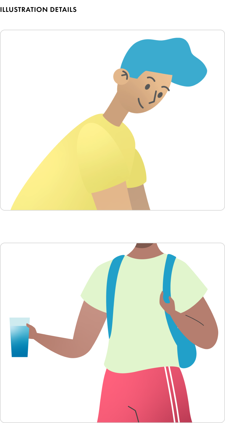
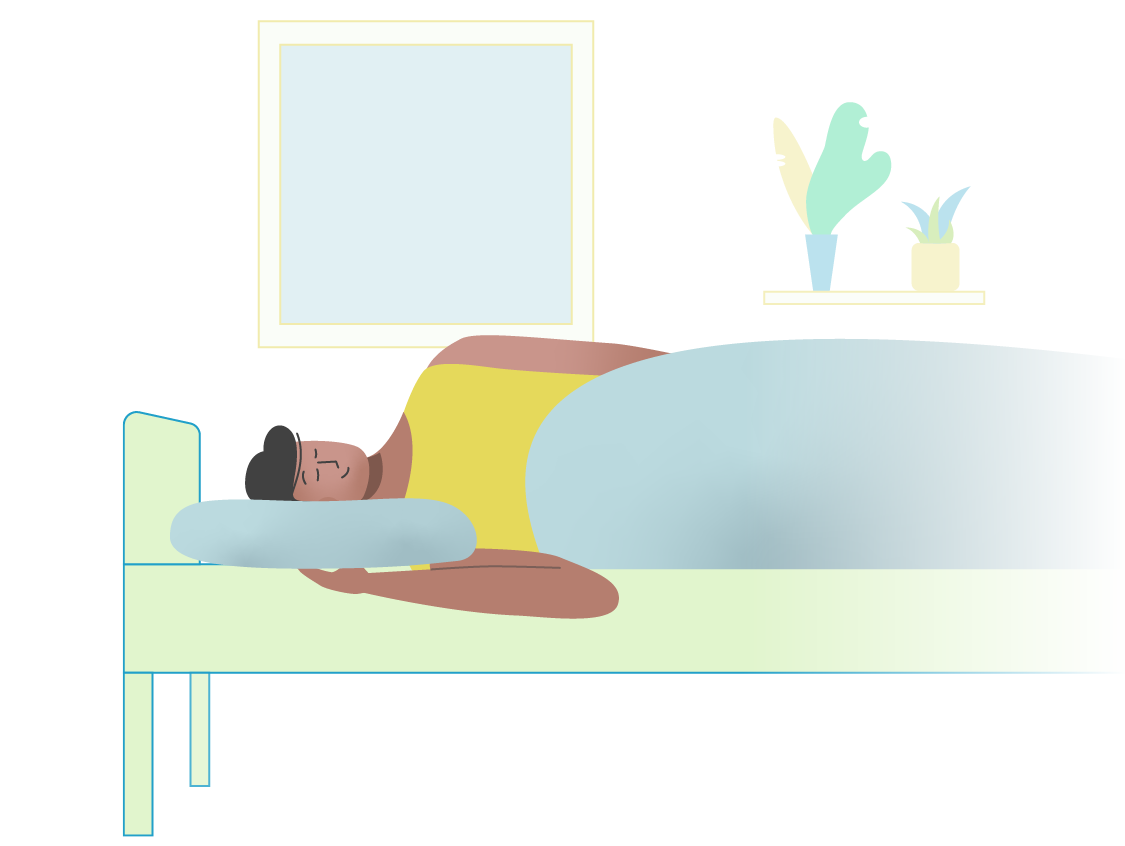
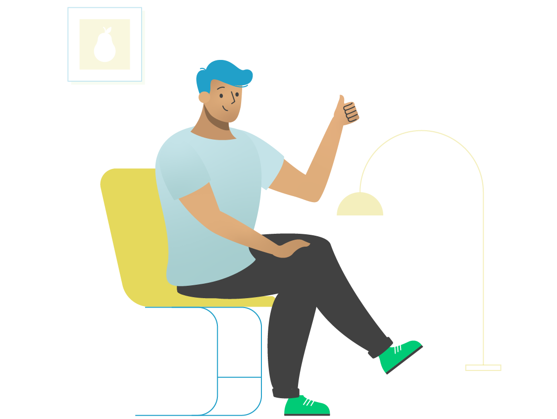
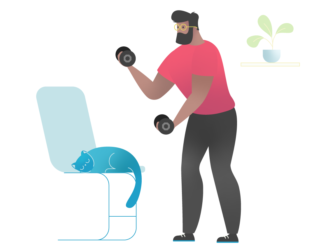
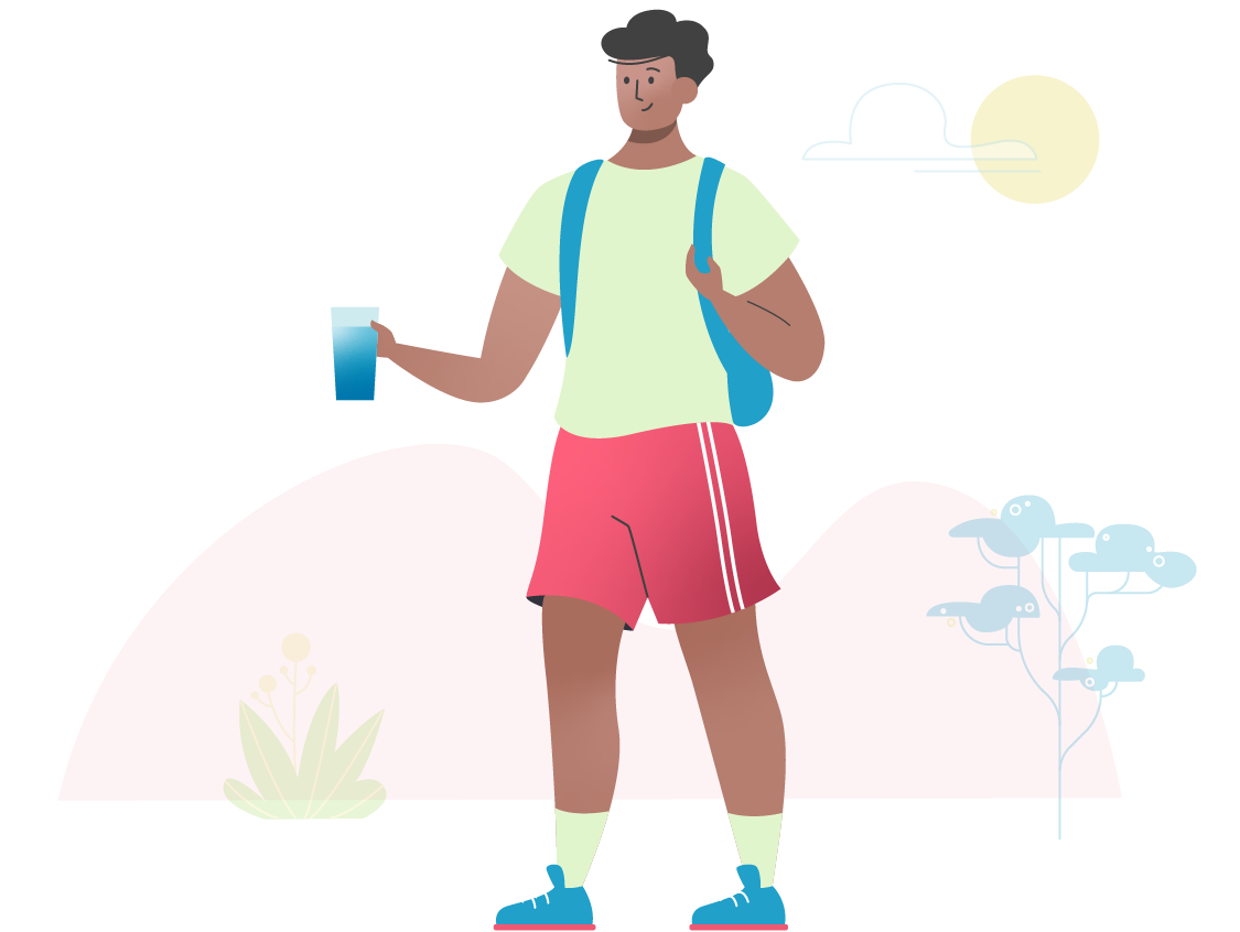
The tasks and their benefits are explained in the Hints section where each is represented by an illustration. The user can access each hint from the “info” icon next to each item in the checklist.
The tasks and their benefits are explained in the Hints section where each is represented by an illustration. The user can access each hint from the “info” icon next to each item in the checklist.

research
Motivation can be supported through straightforward interaction and delightful characters
Part of the discovery phase was analyzing indirect competitors, apps that work with healthy habits. I noticed how much attention was given to illustrations and a consistent color palette. Notably, Duolingo – an app for learning languages, but one that works very much with motivation – is practically built on a universe of bubbly characters. Another takeaway was that the primary UI should be uncluttered and put all focus on the user’s accomplishment, that is checking off those boxes.
branding
Soothing pastel colors, personality and depth through the use of gradient fills
Part of the discovery phase was analyzing indirect competitors, apps that work with healthy habits. I noticed how much attention was given to illustrations and a consistent color palette. Notably, Duolingo – an app for learning languages, but one that works very much with motivation – is practically built on a universe of bubbly characters. Another takeaway was that the primary UI should be uncluttered and put all focus on the user’s accomplishment, that is checking off those boxes.