Best in Covid
Role
UX research, UI, prototyping, branding
Client
personal project
Year
2021
UX research, UI, prototyping, branding
Client
personal project
Year
2021
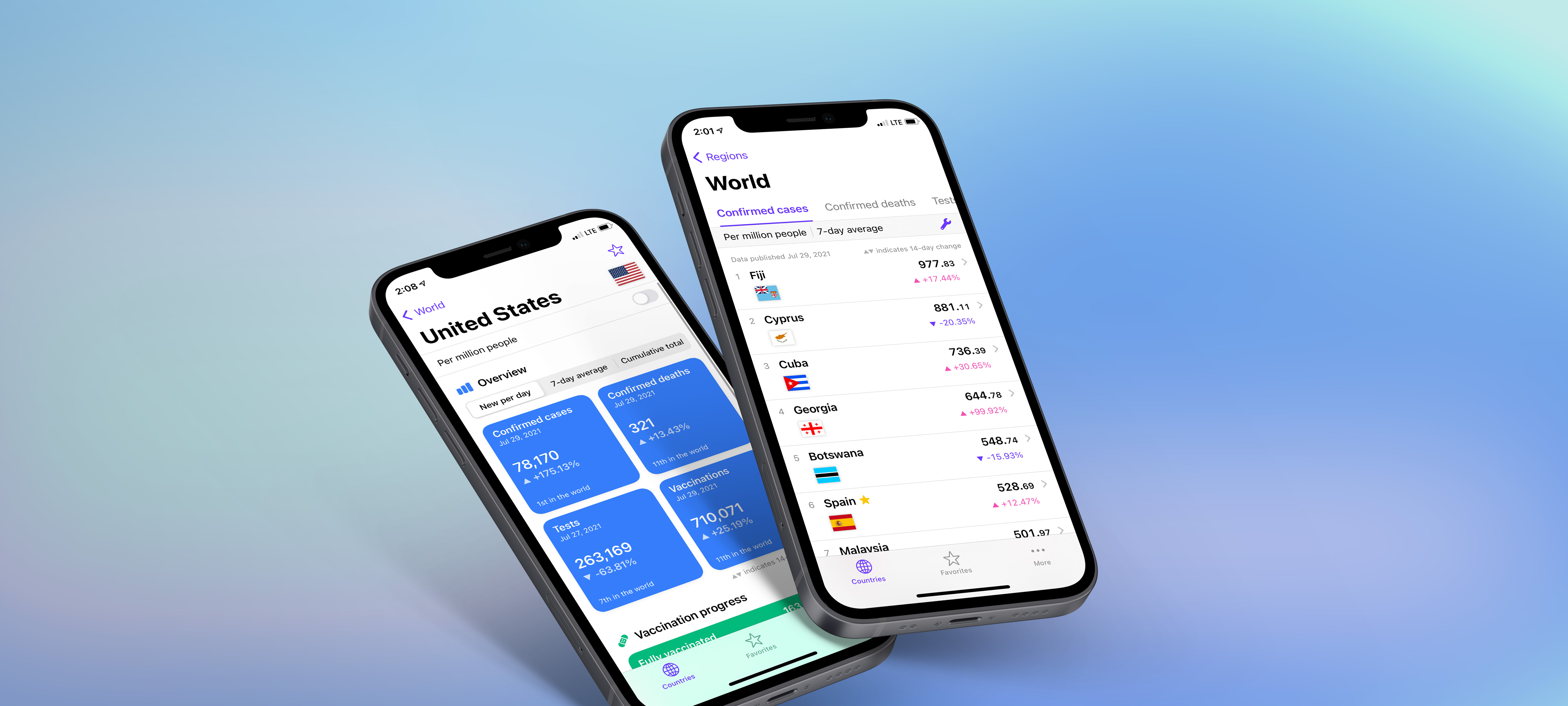
Best in Covid is an iOS app, which compares the Covid-19 situation around the world. The user selects the region and can switch between 8 metrics such as the number of cases or the number of people who are fully vaccinated. Countries with the highest numbers appear at the top.
PROBLEm
How can one compare the Covid-19 situation in their country with other countries where they have family, friends or travel plans?
News and information about the pandemic often concentrated on one specific country (as in the local news) or on absolute numbers – meaning the most populous countries were highlighted. We felt there was a lack of context and comparison between countries and regions. This was especially important if you had family and friends in different countries or when planning travel.
solution
An app that ranks countries according to the number of cases and other metrics and presents data in a structured and visually pleasing way.
I was invited to this project initiated by my friend Adam Nohejl. Together we took it from first prototype to a functional and highly-rated app published on the AppStore.
Through designing this app I got to know and fell in love with Figma.
Through designing this app I got to know and fell in love with Figma.


User research
Global crisis, individual stories
Based on interviewing potential users, we created 4 personas. We finally focused on 1 personna, which represented the key needs.
Yasmine, a young woman from Beirut, has a boyfriend living in Paris and family in Brazil. She wants to know when she can see Saad and if she should be worried about her aunt in Rio.While nobody could give Yasmine exact answers to her questions, she helped us see that a typical user follows a fixed set of countries and looks how they compare with where they reside. This led to the first wireframes and user flows.

INTERFACE
Using iOS functionality to create a simple and intuitive explorer of a vast data set
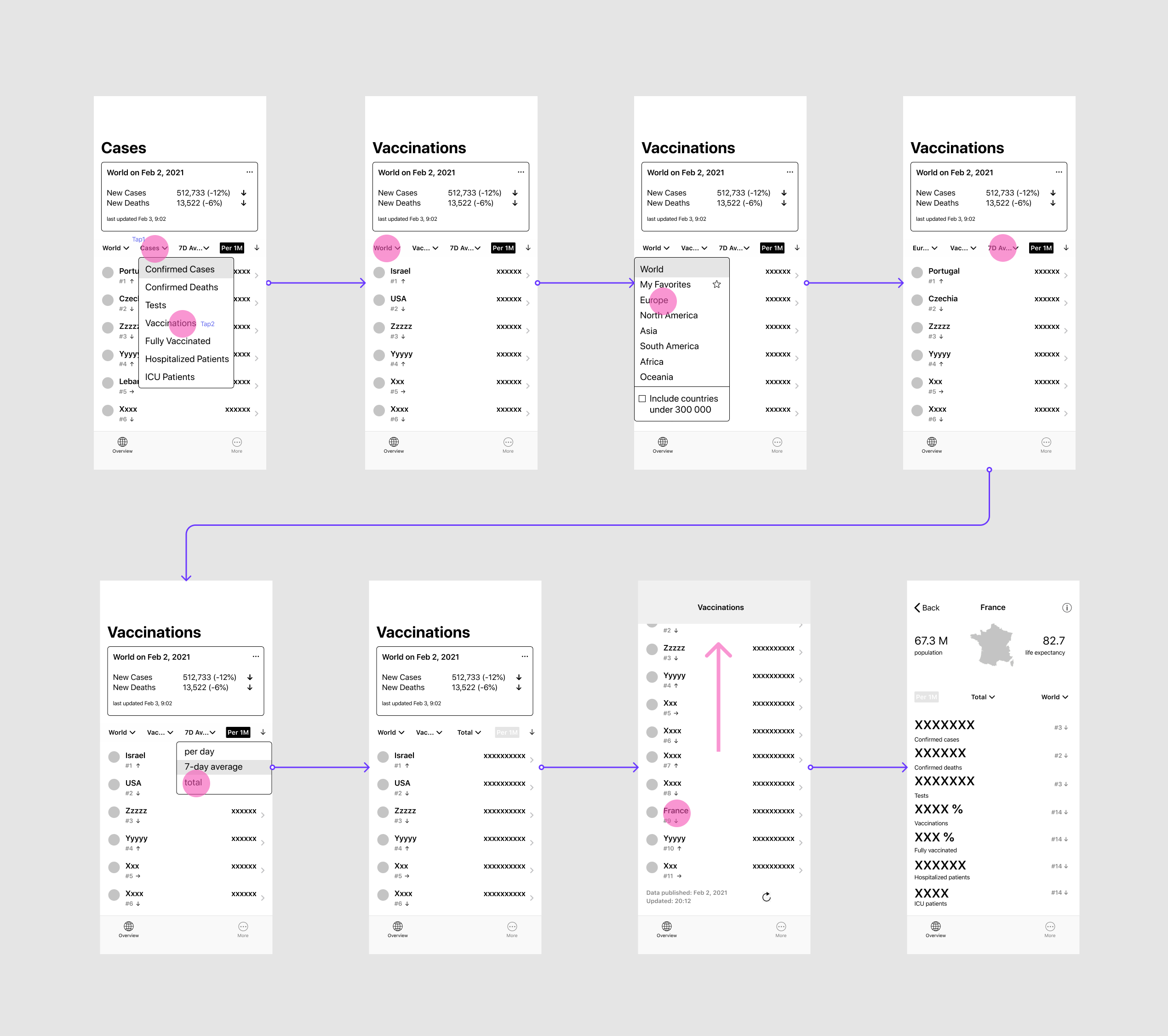
The first prototype used 5 rows of controls. About 20 iterations later, after tests and interviews with users, we arrived at our solution with one permanently visible control, 2 filters in a folding/unfolding section and the choice of a geographical region moved to another screen. This puts the main focus on browsing different metrics and frees a considerable amount of space for the content.

visual design
How might we create a visual experience without a single graph?
The goal was to keep the app visually light and neutral, close to a utility. It had to suggest scientific objectivity, but avoid being too dry to feel intimidating or unfriendly.
Another problem was to create visual appeal although the app is purely numbers-based and besides country flags offers little visual content. For this reason, the Country Detail screen uses widget-like shapes and a thoughtful typographical hierarchy to create more of an infographic than a list of figures.
Another problem was to create visual appeal although the app is purely numbers-based and besides country flags offers little visual content. For this reason, the Country Detail screen uses widget-like shapes and a thoughtful typographical hierarchy to create more of an infographic than a list of figures.


user testing
UI choices proved to be logical for users.
Favorite feature: Favorites.
We used Test Flight to see users reactions to the first functional version.
A bit of a surprise that immediately after I opened the app, numbers and statistics jumped out at me instead of an intro page / page with some kind of menu. It took me a moment to orient myself and realize that I will not find anything “more” there. From that point on, on the otherhand, I really appreciated this minimalist and transparent approach and I think it's great for regular use :)
Tereza
takeaways
Solve one problem at a time.
We faced an overwhelming number of questions, but ultimately found answers, one by one. Though the result could not satisfy all users, we were able to build a functional and highly-rated product.
The app had around 10 000 downloads. I believe it had potential for more, but as a non-profit project very little energy was alloted to marketing efforts.
The app had around 10 000 downloads. I believe it had potential for more, but as a non-profit project very little energy was alloted to marketing efforts.