Tasks: logo design
UX
webdesign & development
Client: National Library of Technology
Year: 2020
UX
webdesign & development
Client: National Library of Technology
Year: 2020
National Repository Logo and Support Website
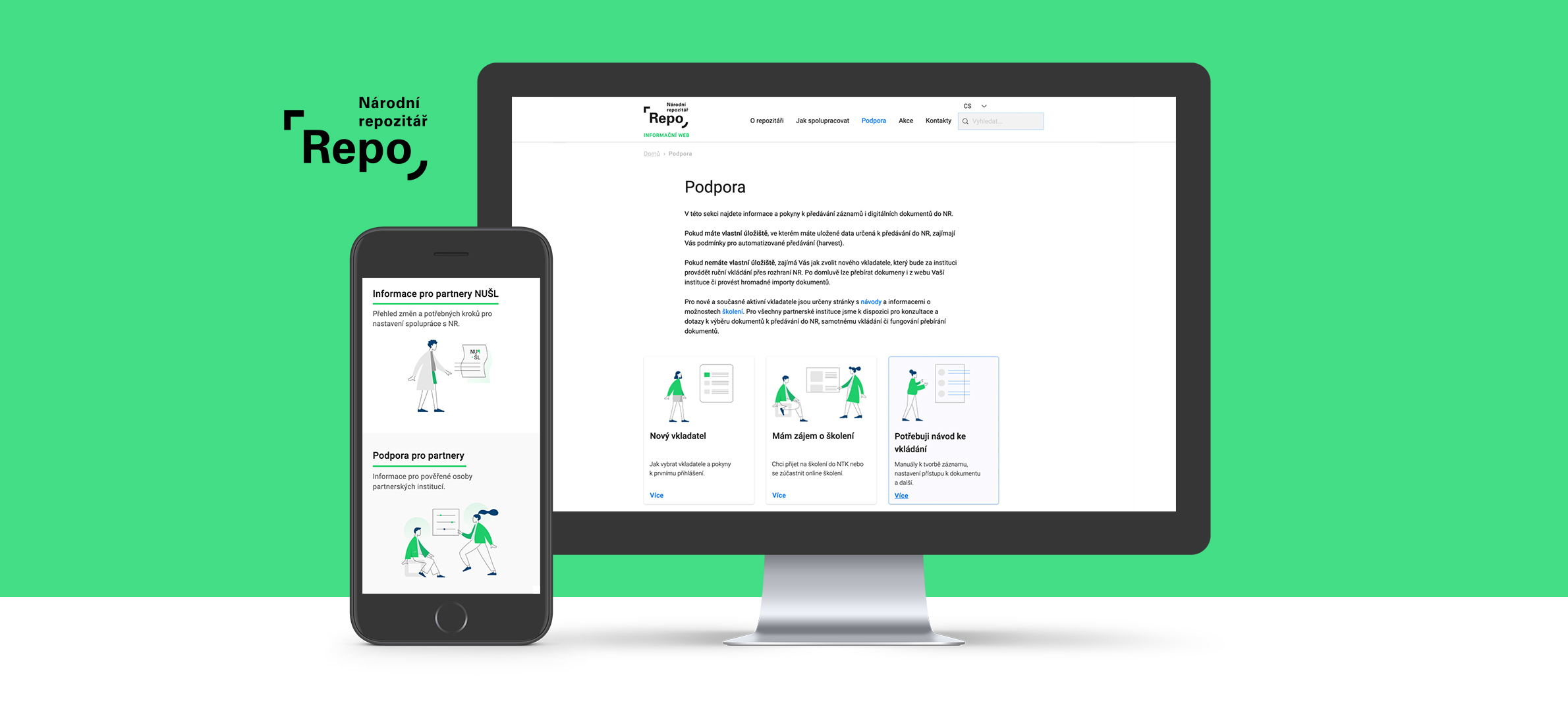
My logo design revolved around the idea of a permeable and open container, a frame shaped by its contents (a sharp edge around the “R” and a soft one around the “o”). It is intentionally simple and mainly text-based to keep it compatible with its parent institution, the National Library of Technology. At the same time, it must be distinguishable since it will be a self-sufficient entity.I also proposed a dynamic version of the logo, which displays the number of currently accessible documents and is therefore constantly changing. I consider this a key metric because the repository’s value will be defined by its contents.
The website is intended for those adding records to the repository, like a help section. My goal was to make it friendly, accessible and not threatening. I added illustrations, card navigation, related topics and glossaries to lead users to what they are looking for.
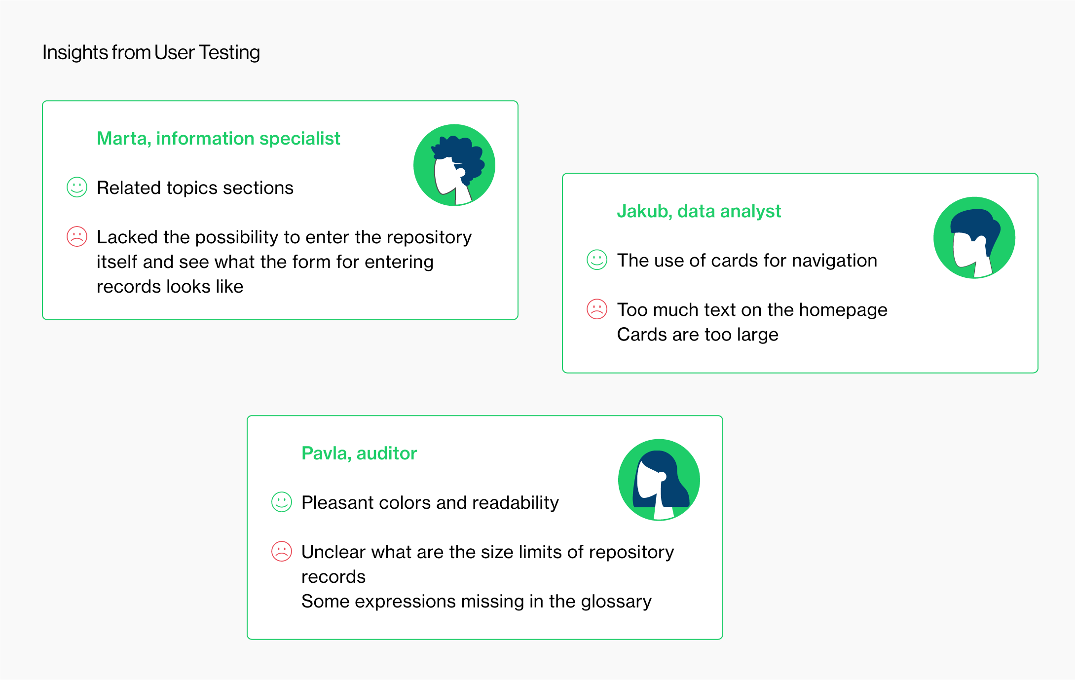
I created personas, user journeys and tested the site on a number of users. I developed the website in Wix.


