Tasks: city visual identity proposal (unrealized)
Client: Ústí nad Labem, Czechdesign
Year: 2021
Client: Ústí nad Labem, Czechdesign
Year: 2021
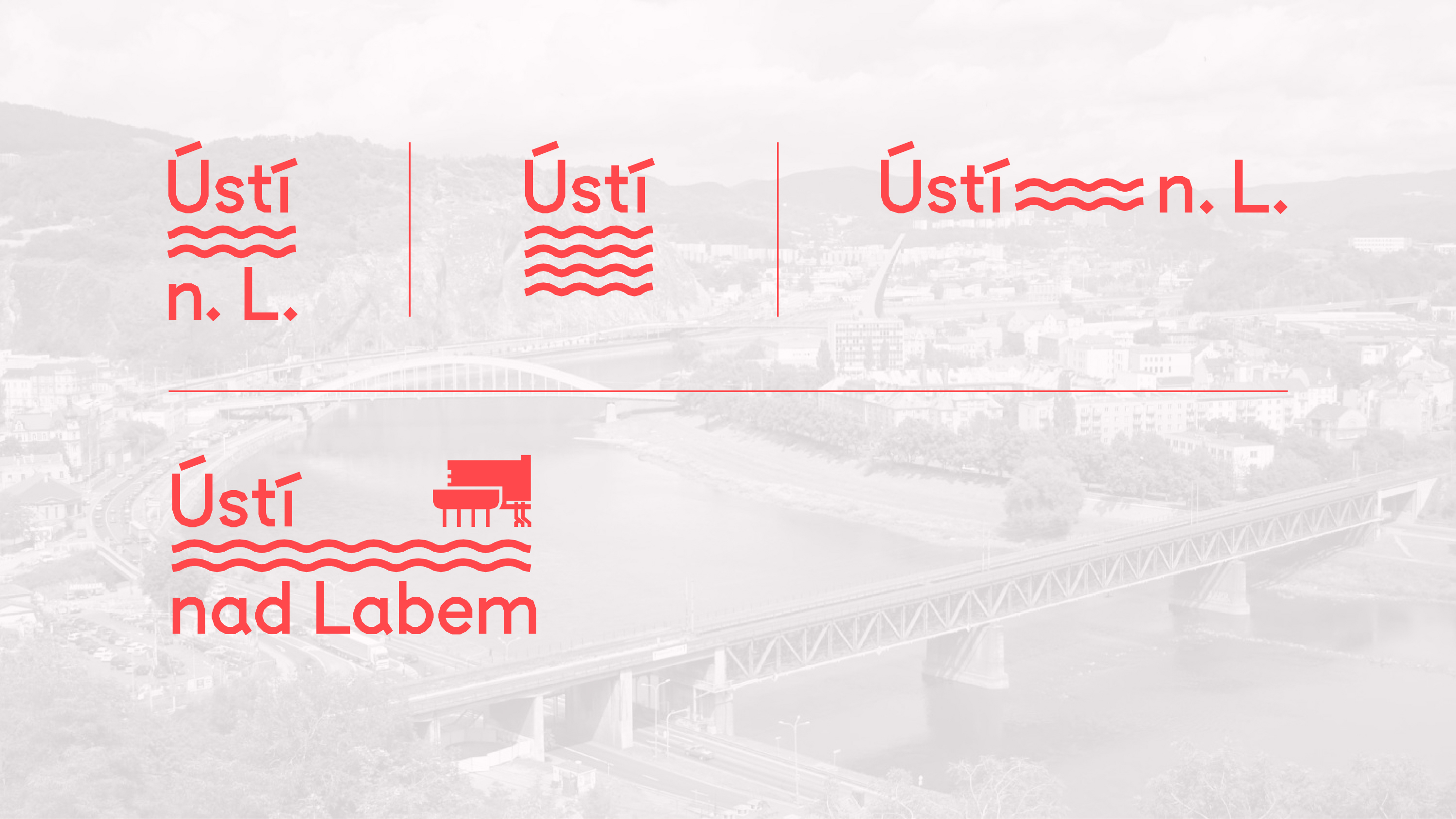
Visual Identity for Ústí nad Labem
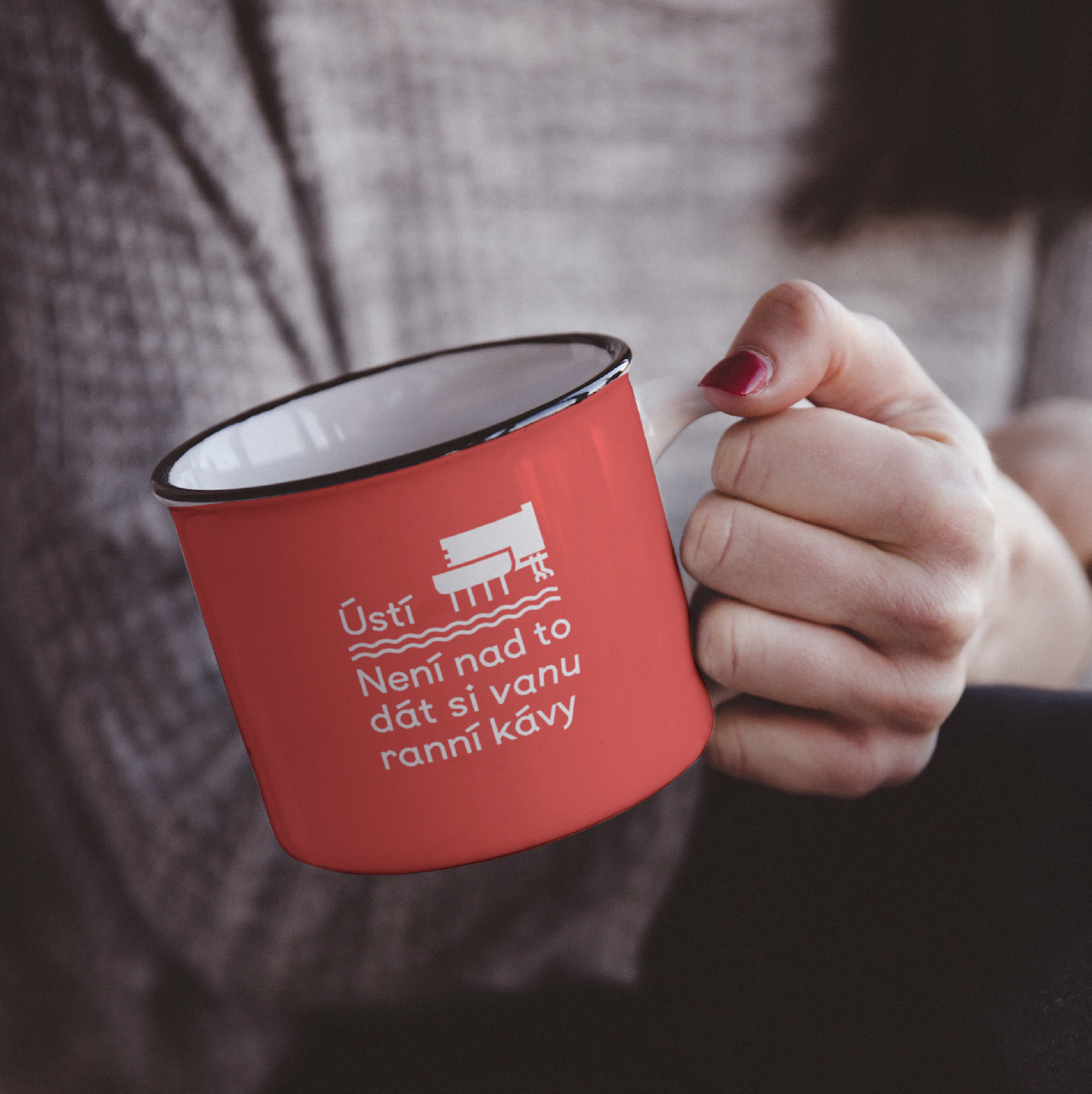
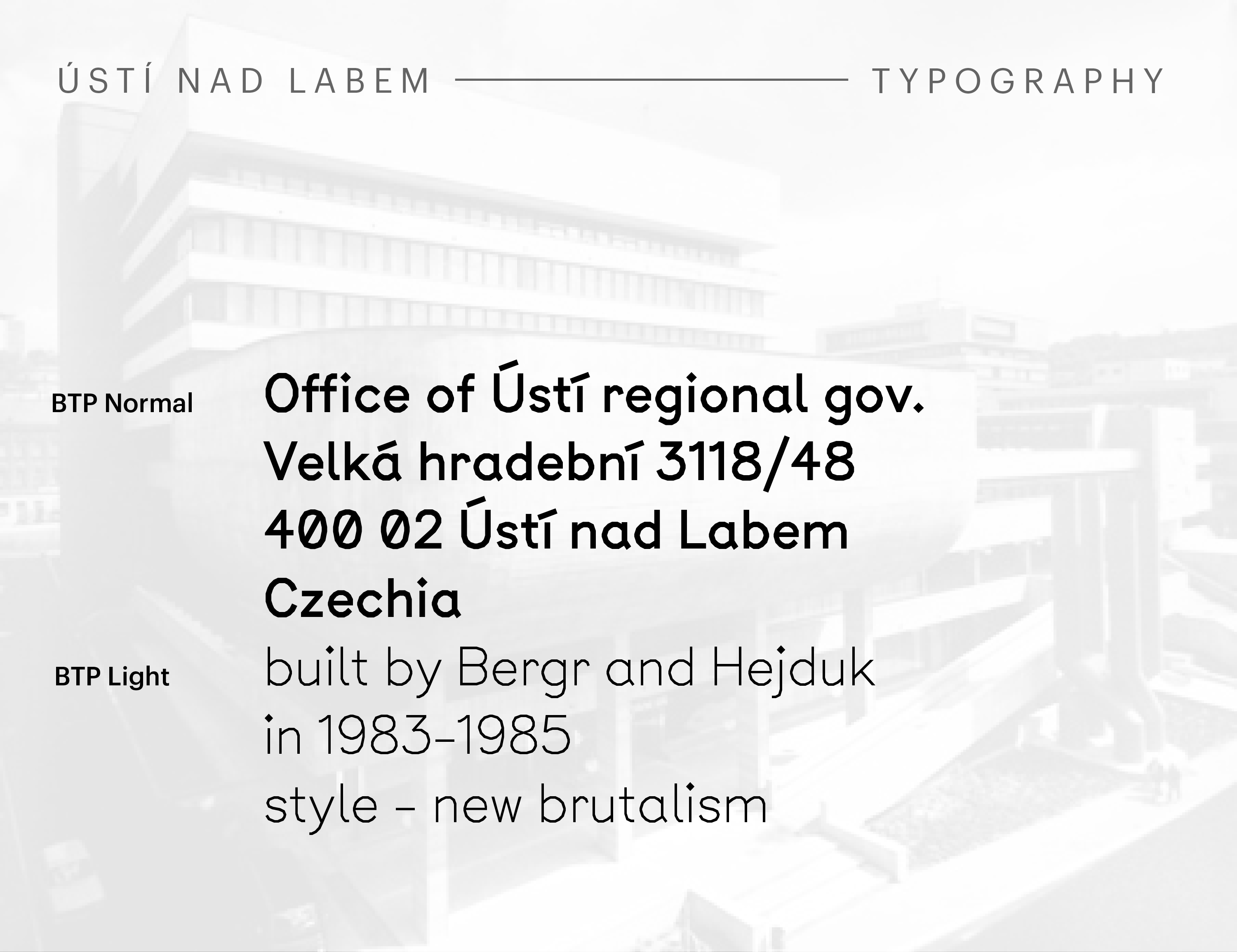
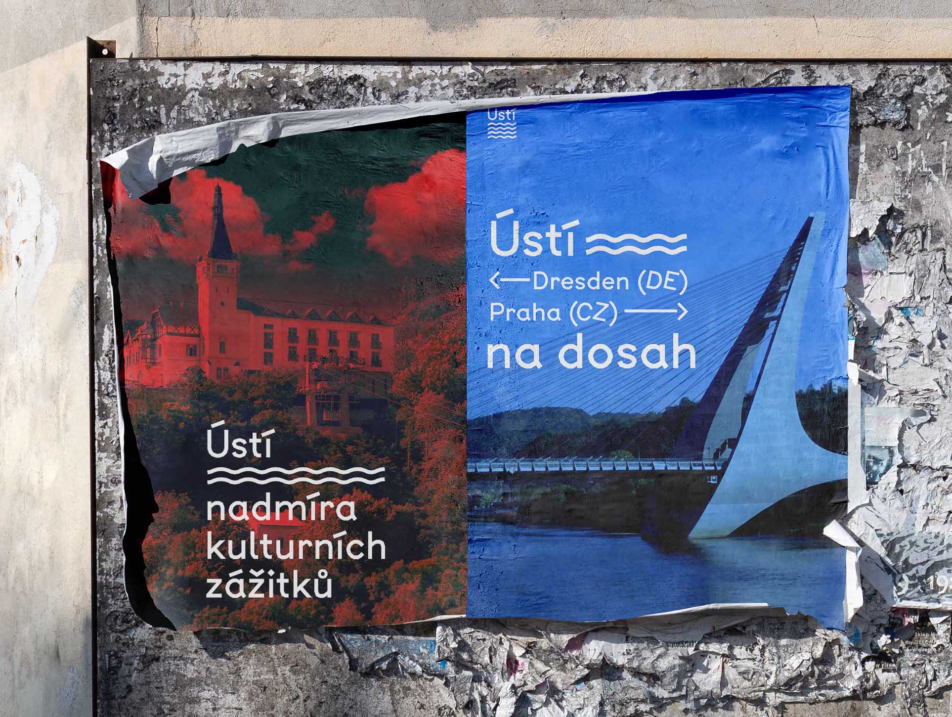
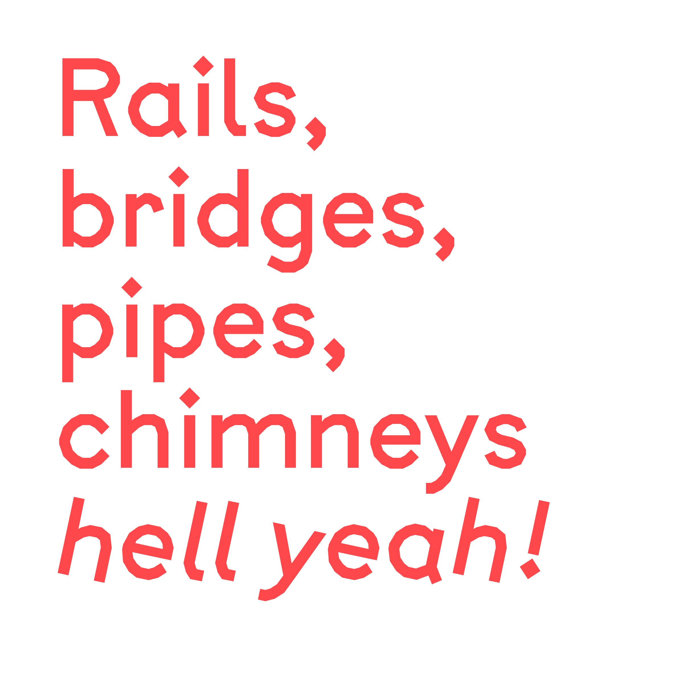
Ústí is a city in northern Bohemia. It has seen many ups and downs as industry has brought it wealth and expansion but also damaged its environment.I based my proposal for its identity on the angular typeface BPT (Building, Typing, Publishing) by Jeremy Perrodeau and Guillaume Grall for A is for Fonts. The typeface was originally created for a project called "Somewhere between graphic design and architecture…". It is complemented by pictograms of iconic buildings in the city.
The city boasts an impressive array of architecture including huge factories, luxurious villas as well as progressive residential buildings from the interwar period and brutalist structures from communist times.
The identity applies not only to the city, but to its 3 subdivisions as well as a range of city-owned organizations (e.g. swimming pool). Colors and appropriate pictograms differentiate these three categories.